SHiNE 2024
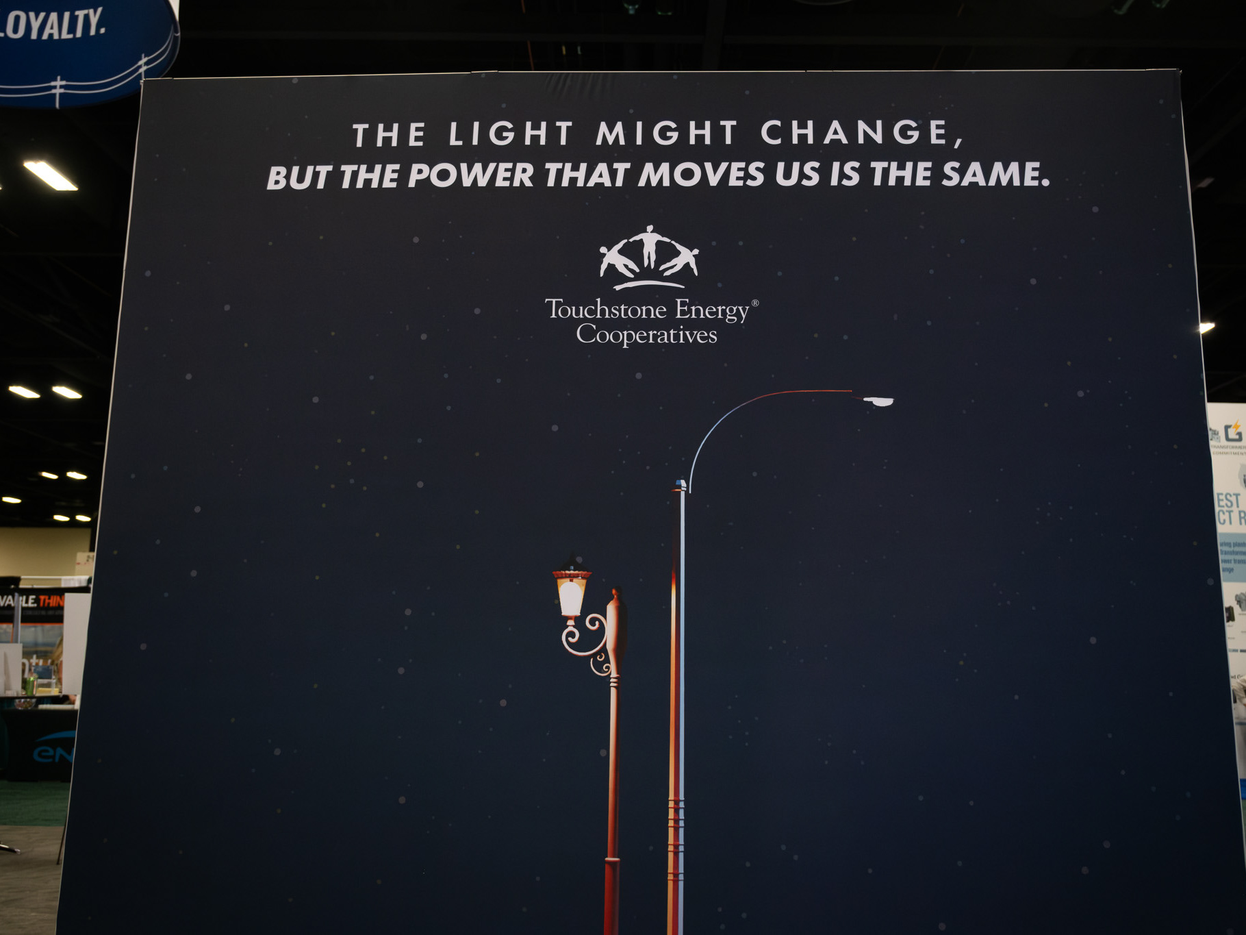
Designed and produced branding for program rebrand. The design is inspired by bright, impactful color and type to draw the user's eye. The "i" is lowercase to draw subconscious focus and can also be used as a person in future logo iterations for various campaigns or fun promotions. It can also be thematically tied to the humanity of the program - behind the name and program are actual, authentic people looking to build and design your website.

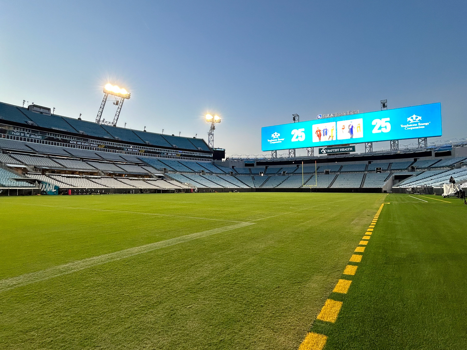
Touchstone Energy 25th Anniversary Branding 2023
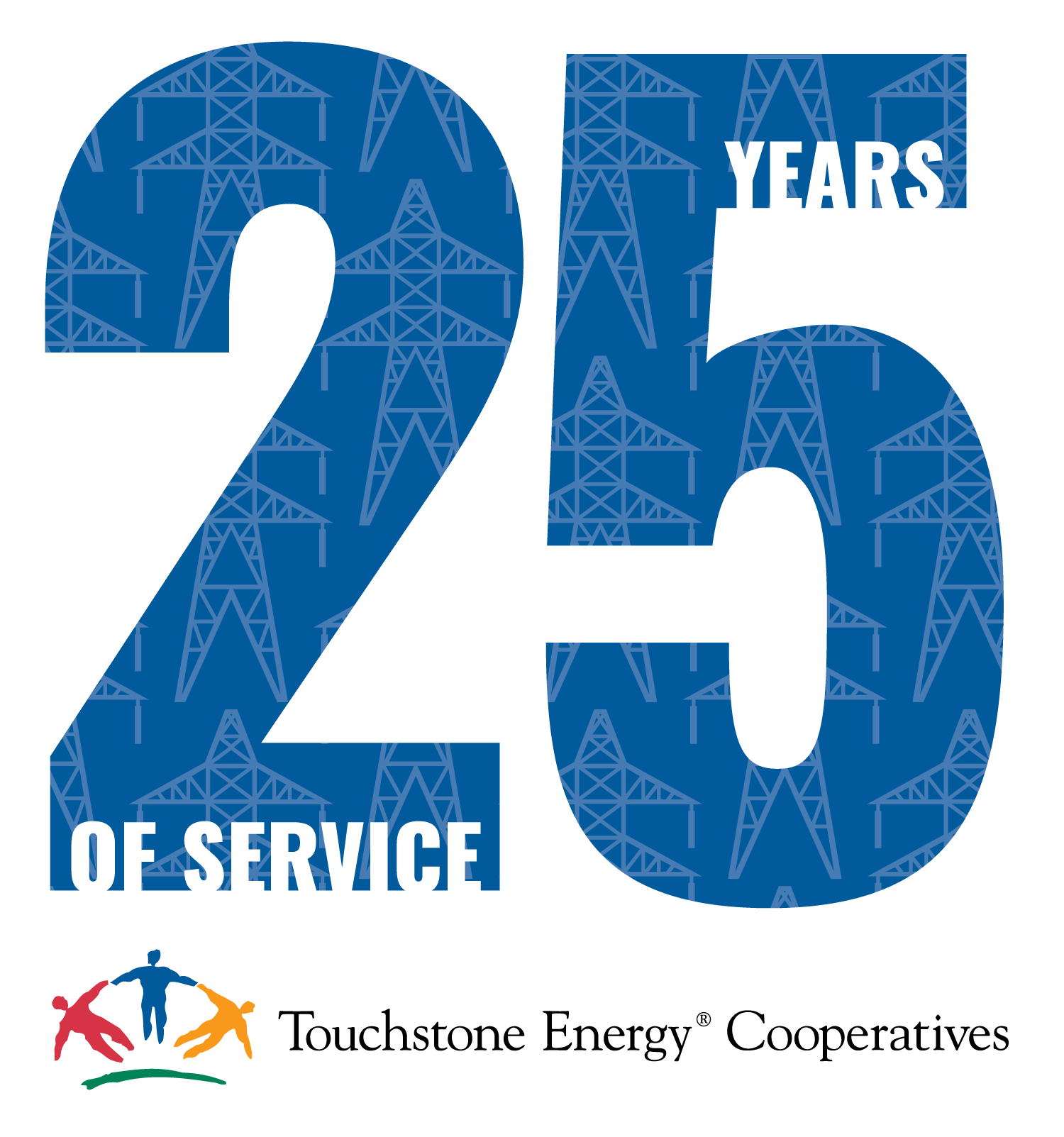
Designed and produced 25th anniversary branding.
Various iterations of the 25th logo.
Email Footer
Site Header
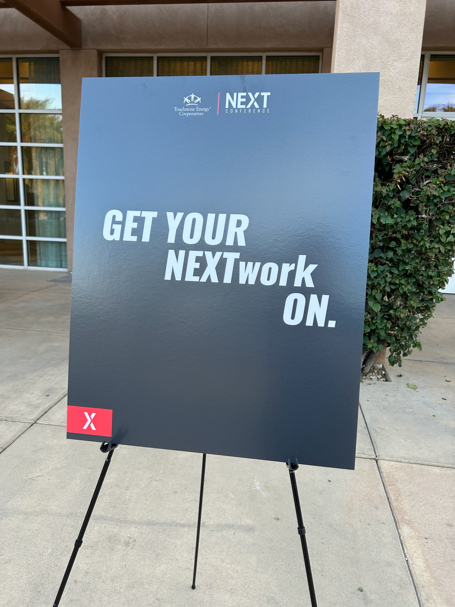
NEXT Conference Branding
Various Logo Iterations



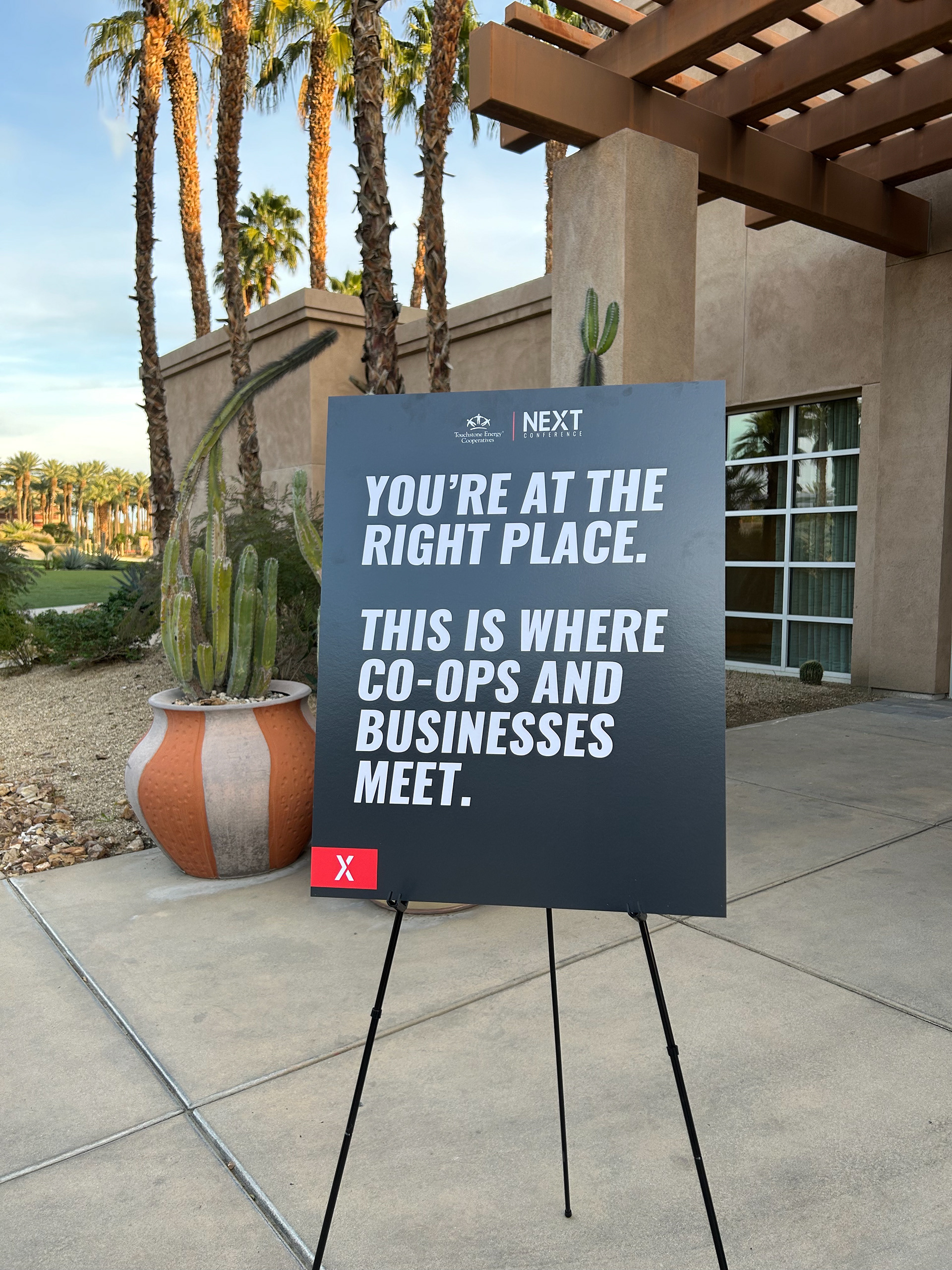
On-Site Signage
Sizzle Videos
